Port Hope: Rebranding Fail
 How do you know when it is time to fire your Marketing/Communications consultant?
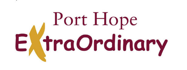
When they use Comic Sans as the font for your city logo.
Comic Sans, for those who don’t know, is perhaps the most maligned font on the planet. It is generally avoided by marketers, designers, communication professionals… really, anyone who has designed anything more than a bake sale poster in Microsoft Word.
There are multiple websites in existence calling for an outright ban of the font. It elicits universal hatred from anyone working in  the creative economy and gives an overall impression of cheapness and shabbiness to many, if not most, casual viewers.
The reason?
All fonts have personality and purpose. They often convey as much of a message as the text/copy that they spell out. Fonts offer first impressions — the brain will analyze typography and appearance well before textual meaning. They set the tone for your statement, logo, message, tagline, whatever.
Want to convey a serious tone? Use a serious font. Want to convey a whimsical feeling? Use a whimsical one. Want to invite children to your 8-year-old’s birthday party? Use Comic Sans.
Because, really, that is what the font was designed for: for kids and comic books. Created by a Microsoft designer that specialized in child-oriented fonts, Comic Sans was based on the speech bubbles of mainstream comics. Hardly the stuff of serious marketing material.
It is also, perhaps, the most overused and cliché font on the planet. If Comic Sans’ sheer ugliness is not enough for most designers to avoid it, its recognition factor pushes it well into the stratosphere of unsuitability. Fact: no serious designer wants to be caught using commonplace fonts. It diminishes their originality and creativity. In short, it makes them look like an amateur — like a hack.
A font like Comic Sans? It makes their product look like something that was designed for a Grade 6 science fair poster.
None of this seems to have filtered through to the marketing consultants hired by the Municipality of Port Hope — who I won’t name here, for pity’s sake.
No, these folks seriously put together a municipal logo that blended Comic Sans with a rather generic serif. They spiffied this (either incredibly bold or incredibly naïve) design with a simple brushstroke of “paint” — itself a clichéd design tool. And, voilà, included it as part of a $100K rebranding platform.
Ouch.
Sorry, Port Hope. But I think you’ve been had.
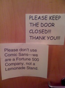
On the plus side, I think you’re the best darned lemonade stand in Ontario.
EDIT:
In case you missed them. The other two proposed logos.
Keep in mind, this was an over $100K project.
9 thoughts on “Port Hope: Rebranding Fail”
Comments are closed.


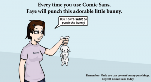
You have used a panel from Questionable Content by Jeph Jacques without attribution or credit… shame. A professional creative business such as yours should know better and, it seems to me, would be extra careful to give proper credit where it is due to your creative fellows. Fail.
You’re absolutely right, Mark.
I usually give credit for artwork/photography. On this occasion, I found the comic on around 11 different sites — none of which cited Jeph. It had become, in the popular parlance, a meme.
Say, Mark, you’re not a comic sans user are you? 😉
Trebuchet for me!
clean sans serif.
well done.
Outstanding find.
100K? Are you kidding me? And what is with logo #3 with the reverse characters? That’s the way I sign my dog’s name on greeting cards to be doggsie-cute. EPIC EPIC fail.
I was flabbergasted.
My gast was flabbered.
And my flab is aghast! I designed a logo for Port Hope a number of years ago built around the slogan LIVE WORK SHOP (not mine). Of course everyone read it as Live Workshop. The typography was considerably more appropriate.